
Creative Challenge.
Eliminate visual fragmentation and technical debt within a complex enterprise icon library to support scalable, high-fidelity co-branding.
The Strategy:
Systemic Re-Architecture.
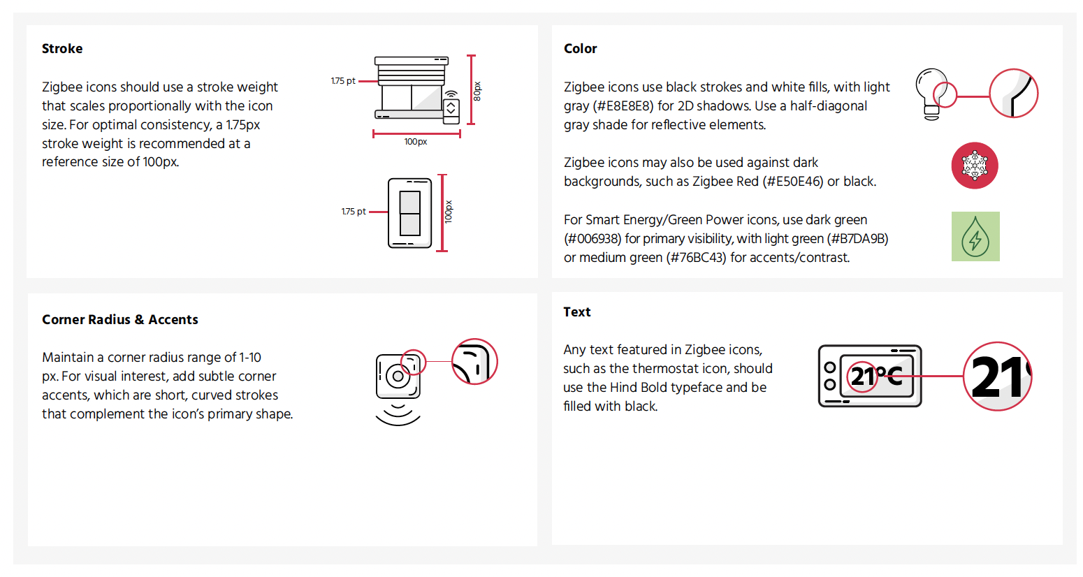
I replaced the legacy library with a rigorous, geometric governance framework. By defining standardized stroke logic and visual weight parameters, I transitioned the library from bespoke, one-off production to a self-sustaining system.
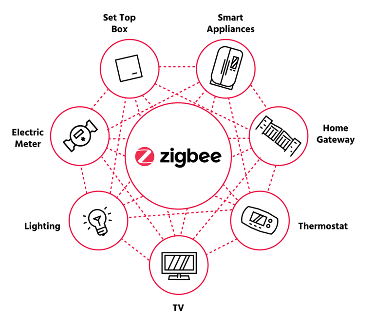
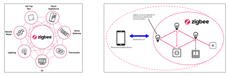
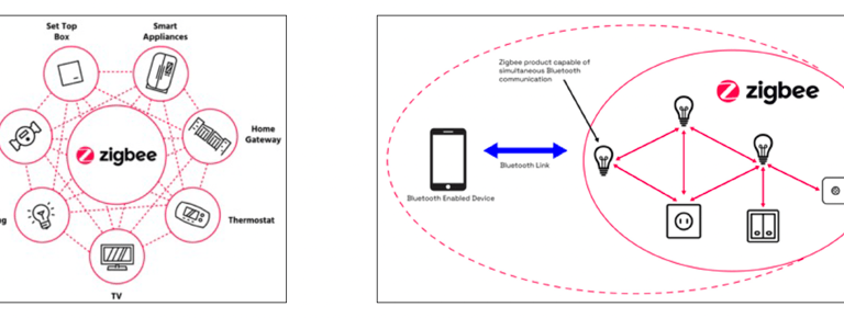
Inconsistent iconography before audit:
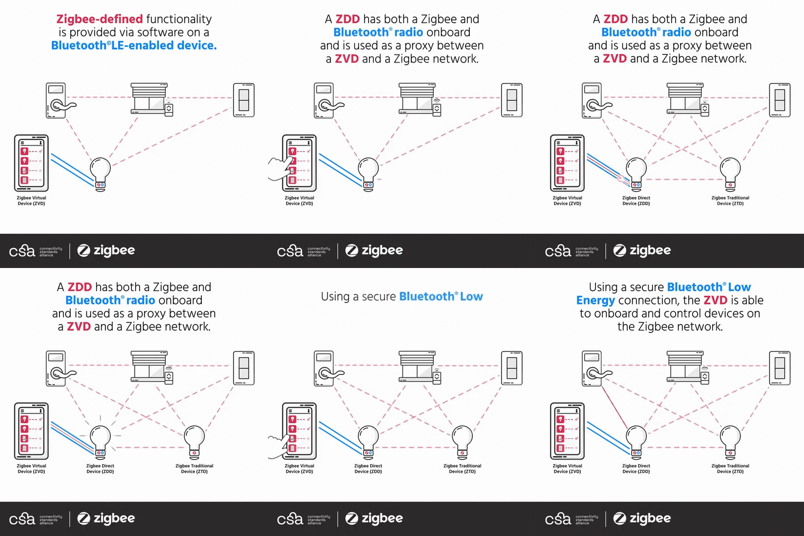
The Audit:
Diagnosing Fragmentation.
Before re-architecting, I performed a comprehensive audit of existing assets, revealing:
Visual Noise: Disparate 2D/3D styles and inconsistent shading.
Technical Debt: Excessive detail compromising legibility at small scales.
Governance Gap: A lack of unified visual grammar undermining enterprise-wide co-branding efforts.
Enterprise Iconography & Standards.
The Strategic Value.
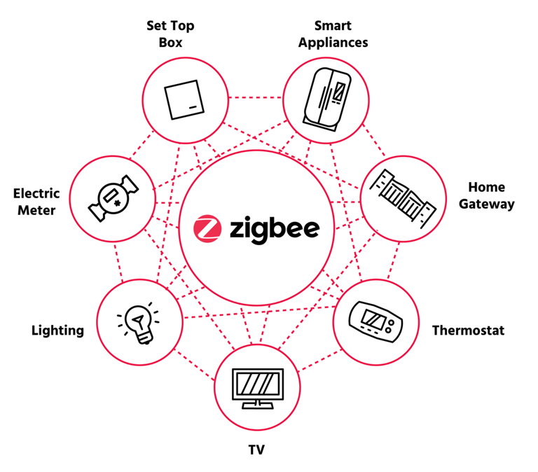
This system provides the visual consistency required for an enterprise-level brand. It replaced "design-on-the-fly" with a modular language, allowing the team to scale the library without incurring new technical debt.
Technical Specifications
(The Governance Logic).
Visual Grammar: I developed a strict geometric language for the brand’s iconography. By standardizing stroke weights and corner radii, I turned a disparate set of symbols into a cohesive visual shorthand. This did not just clean up the files; it reinforced the brand’s authoritative, high-fidelity personality across the entire enterprise.
Geometric Rules: Standardized corner radii and line endings to prevent visual drift.
Animation Readiness: Engineered for perfect weight retention during motion, supporting future-proof usage.
amanda[at]asouthworth.com | © 2026.

Hobbes, Head of Keyboard Obstruction