
Winery Brand Identity & Launch Strategy.
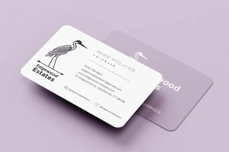
For Edgewood Estates, a Connecticut winery targeting young locals and tourists, I developed a brand identity centered on relaxed elegance. The design was inspired by a heron frequently spotted at the estate’s barn. This meaningful local symbol serves as the visual anchor for the entire brand system.
The Strategy.
I curated a coastal-inspired color palette that includes the town’s signature purple. To balance traditional estate values with a modern feel, I utilized a high-contrast typographic pairing of Montserrat and Playfair Display. This combination ensures legibility while maintaining a premium aesthetic.
The Execution.
I owned the full project lifecycle, ensuring a seamless brand experience across all touchpoints. This included the responsive website, print materials, and social media assets. I also developed custom visual guides for taste and pairing suggestions to enhance wine accessibility for new customers.

The Result.
This cohesive identity built a loyal customer base through an engaging and consistent brand experience. The project demonstrates my ability to take a brand from initial concept to a full-scale market launch.

Client Testimonial:
Amanda truly understood our business, delivering exceptional, cohesive designs for our logo, website, and marketing materials. Her collaborative approach and foresight have been instrumental in our growth.
Contact
amanda[at]asouthworth.com
© 2026. All rights reserved.